Your Way | Kia Roha
2023
Pōneke
Using Your Way | Kia Roha’s four core mātāpono (values) as their guiding pou—Rangatiratanga (self-leadership), Manawatoa (courageous), Whanaungatanga (connection) and Kotahitanga (inclusion)—We developed a visual identity that speaks to empowerment, self-determination, expansion, and navigation.
Research and findings from the discovery process alongside a deep dive into the tūāpapa (foundations), moemoeā (vision), kaupapa (purpose) meant we were able to paint a clear picture of where the organisation had been to determine where they were wanting to head.
The brand territory behind the new name (Your Way | Kia Roha) was: “Our Collective Waka” and was chosen because it signalled the organisation’s intent to move forward collectively with the community—charting new pathways and aspiring to move the whole sector.
“Your Way“ speaks of self-determination and refers to the fact that each person is unique. “Kia Roha“ means to spread your wings and fly. It speaks to people being aspirational, actively seeking and reaching their goals.
We used Your Way | Kia Roha’s four core mātāpono (values) as our guiding pou—all grounded in te reo concepts: Rangatiratanga (self-leadership), Manawatoa (courageous), Whanaungatanga (connection) and Kotahitanga (inclusion). Working within the realms of these words lead us to establishing a guiding whakataukī—this acted as our northern star throughout the duration of the design process.
Ehara! Ko koe te ringa e huti punga!
Yes, yours is the arm best suited to pull up the anchor!
You have it in you! Pulling up the anchor on a waka requires intention, focus and determination. You must trust yourself that you have the physical and mental strength to pull up the anchor and navigate or lead the journey ahead.
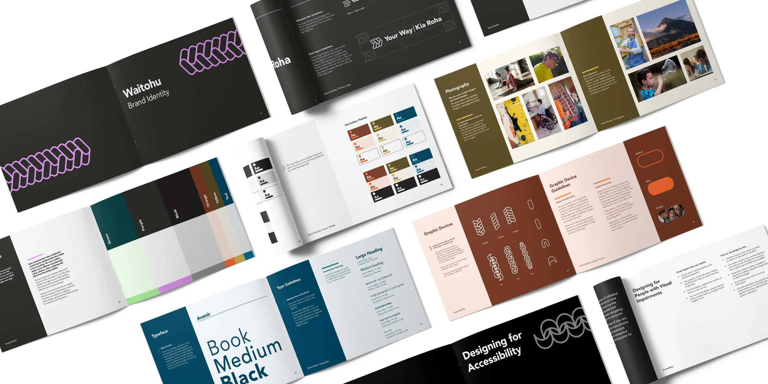
It is from here we were able to develop a visual language around the ropes and knots used to anchor the waka. The logo icon, and later the graphic devices and patterns, host details of a stylised woven rope—used to ‘lift the anchor’. Within this design we can see a twisting and a crossing of paths with no clear beginning or end. This lends itself to the idea of a path unwritten. Inspired by the whakataukī, this icon indicates that we are in charge of our own path, whatever that may be, forward moving with twists and turns.
Right from the beginning, research was carried out to establish a clear understanding of what our neurodiverse audience needs were. Some of the many considerations we made during the process included but weren’t limited to; tunnel vision, loss of acuity or blurred vision, colour blindness, low vision or blindness, and visual noise levels. This research resulted in the development and considered use of a monochromatic colour palette, the choice and application of a clear geometric-based typeface and careful rules around layering or using graphic devices, image and videography.
Roles + Responsibilities
Helene Malandain & Five & Dime—Strategy, Project Management, Copywriting
Brittany Davies—Lead Mahi Toi Māori
Sophia Bishop—Colour & Accessibility Research
Process: Research, collaboration with Your Way | Kia Roha working group, extend from Five & Dime’s strategy & development.


